New: Customize playhead style and behavior
June 30, 2022
Here’s a bunch of new functionality designed to give you more control over how Soundslice displays the currently playing music.
Previously, our playhead (the vertical line that shows you where you are in the music) was always orange, and notes would light up when they were played, like this:

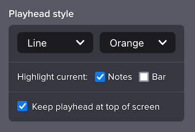
That’s still our default behavior, but starting today you can customize how this works. Our player’s settings menu now has a new “Playhead style” section:

Let’s walk through what’s new here. First, you can choose from four playhead designs.
Line is our default, classic look (as seen in the animation above).
Small rectangle is a bit softer, for folks who find the default behavior to be too in-your-face:

Wide rectangle looks like this:

And Hidden during playback removes the playhead entirely:

Next, you can choose from one of four color themes: Orange (our default), Subtle, Blue and Yellow. This controls the color of the playhead, the color of the currently played notes and the color of the current bar (if applicable).
Next, you can now choose not to highlight the currently playing notes. You might prefer this if you tend to sight-read far in advance; this way you won’t get subtly distracted by the notes changing color.
And finally, you can now choose to highlight the current bar. This can help orient you in a larger piece of music. Here’s what it looks like, using our new Blue theme:

These various controls give you a wide variety of possible aesthetics and functionality. Perhaps disable note highlighting but enable bar highlighting, to emphasize one bar at a time? Or use a wide rectangle for a more subtle scrolling playhead? Or disable everything entirely, giving the effect of a slowly scrolling piece of paper? Give it a shot and let us know what you think.
If you’re a paying customer (thanks!), we’ll automatically save your preferences and apply them to any slice you view. If you’re on our Free plan, you can still tweak these settings but they won’t be saved after you navigate away from the particular slice.
This feature is now live sitewide for all Soundslice users, including embeds. For more, see our new help page.