New features and fixes, Jan. 12
January 12, 2022
Happy new year! Here’s what we’ve launched and tweaked recently.
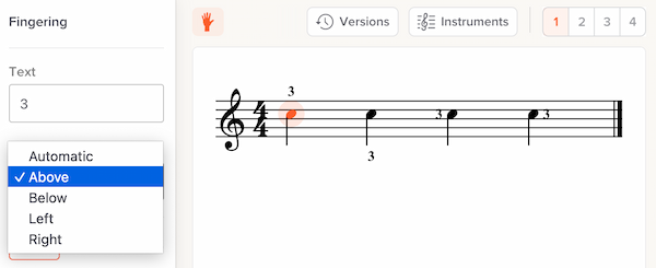
Control over fingering position

By default, our system automatically decides where to display fingering — above a note, below, left or right. You can now override our automatic positioning on a per-note basis. Read more.
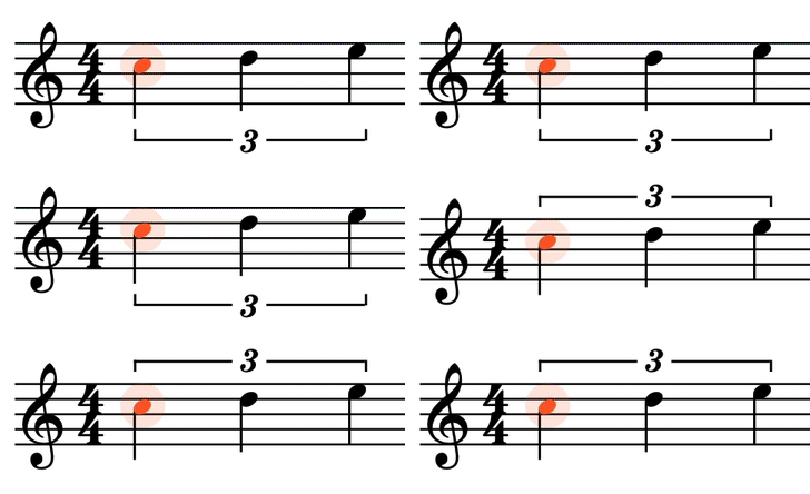
Control over tuplet position

By default, our system automatically decides whether a tuplet marking should be above or below the notes. Now, you can override this. Read more.
Better editor support for smartphones
If you’re using our notation editor on a smartphone, you might notice we’ve tightened the interface in various places, to provide more vertical screen space for your music.
New workflow when starting with a recording
When you create a slice by starting with a recording (as opposed to starting with notation), we’ll now immediately take you to a full-screen version of the video. Previously we assumed you would want to upload notation, so the video remained small.
Our intent with this change is to make it easier to throw a quick YouTube link into Soundslice, for quick practicing (e.g., slowdown and looping) without syncing notation.
Partial support for colored fingering and colored text
We improved our MusicXML importer so that we’ll use any custom colors you’ve used for fingerings or text. We haven’t yet improved our editor to allow for setting these colors directly, but at least there’s a half-solution now!
Keyboard shortcuts to change player speed
You can now use the (somewhat standard) keyboard shortcuts > and < to change playback speed in our player. Read more.
Waveform now allows for moving the selection
In our waveform view — both the standalone version and in the syncpoint editor — you can now click and drag a selection to move it left or right. Previously dragging on the selection would clear it and create a new one.
Assorted editor improvements
We’re always making tweaks and fixes based on your feedback (thanks to all people who make suggestions!). Here are some highlights of what’s changed in the editor recently:
- You can now click the slice title to rename it.
- If you upload a notation file, we’ll now automatically set the slice title. (But not if you’ve manually set the title before uploading.)
- In the touchscreen interface, there’s a new “Select bar” feature.
- Selection edges are now draggable. This works nicely with the previous “Select bar” feature on touchscreen devices.
- It’s quicker to switch between edit and view mode. Previously there was a dropdown menu containing “Editing” and “Practicing.” Now it’s a simple “Edit” vs. “View” button, requiring fewer clicks.
- We’ve added editor commands for 64th, 128th and 256th notes. (These functions are available in editor search.) It was already possible to use these small note values via our “Decrease duration” function, but these additional methods should make it easier to find.
Assorted rendering improvements
We’ve made many improvements to how music looks in Soundslice. As always, there’s nothing you need to do to take advantage of these; the improvements apply automatically to everything on our site. Highlights:
- Accidentals are now right-aligned (previously they were left-aligned), and there’s now a consistent distance between an accidental and it notehead. This is very subtle stuff but hopefully makes the music feel nicer to read.
- Ghost note parentheses no longer collide with dots, accidentals or fingerings.
- Slide (gliss) lines in notation now always have a minimum width. Previously they could be comically small in some cases.
- Arpeggio markings (the squiggly lines) are positioned better. Previously they were a bit too far to the left.
- Bar numbers are now hidden at the start of a new passage. You can override this by specifying a manual bar number.