New features and fixes, July 22
July 22, 2021
Here’s what we’ve launched and tweaked recently. There’s something for everybody in here!
Improved editor touchscreen interface
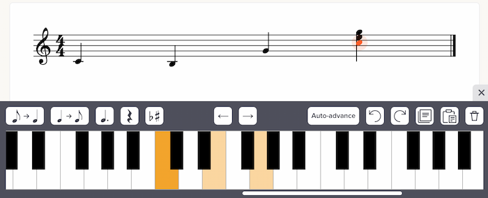
Since launching a touchscreen editing interface last month, we’ve gotten good feedback from musicians actually using it. We’re following up with some improvements directly based on that. Can you spot the differences in this new screenshot?

First, we’ve made the piano keys function as a toggle. If a note is selected and already exists in your notation, you can tap it in the piano keyboard (or fretboard) to remove the note. This feels really intuitive and was suggested by a few users.
Second, we added an “Auto-advance” button. Click that to enable auto-advance mode, which will automatically advance the cursor each time you enter a note. Handy for quick entry of single-note lines.
Third, we removed chord mode. It no longer felt necessary due to the previous two changes.
Fourth, we removed the up/down arrow buttons, to make the interface less cluttered. Those arrows weren’t really useful, as you can simply tap on the keyboard or fretboard to select another note in the current beat.
All of this is covered in more detail in our updated help page. Thanks to the folks who sent us feedback to help guide these changes!
“Pending” students in private courses
This one’s for people in the Teacher plan.
Previously, on the “Manage students” page for a private course, you could add students via email address — but it required the email address to already exist in our system. If you tried to add an email that didn’t yet have a Soundslice account, you’d see an error message.
Now, if you add an email address that doesn’t have a Soundslice account, no problem. The student will be marked as “Pending,” and we’ll send them an email inviting them to your course. As soon as they create their free Soundslice account, they’ll get access to your course. Smooth!
Improvements to student management
Another thing for Teacher plan customers: we’ve made the student management page more useful.
First, we added a dedicated page for each of your students, listing all of the private courses they’re in, plus all of the slices you’ve shared with them personally. (See our separate blog post about the new individual sharing feature.)
Second, we added a way to remove students directly via your students page. This is much faster than removing the student from each individual course or slice.
See the updated help page for more info.
Slice manager redesign
We’ve updated the visual design of the slice manager — the page where we list all of the slices you’ve created.
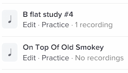
The new design has explicit links for “Edit” and “Practice.” We’d found that some people thought it was only possible to open slices in edit mode — with all of the editor tools taking up valuable screen space — so we’ve provided clear, separate links to both views now:

To help guide your eyes to the right place, we’ve redesigned the slice and folder icons to be more subtle, and to add more color to the page.
We’ve also tweaked the filters at the top of your slice manager:

The “Shared privately” filter is brand new. It lets you quickly find all of your slices that you’ve shared privately — either in a private course or with individual people.
The “Secret link enabled” filter is also new, but in name only. This filter used to be called “Shareable,” but that turned out to be a confusing name, given we now support private sharing with individual people — a totally different thing. Hence the new name: secret links.
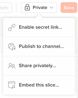
And regarding secret links, we’ve also changed our editor to use this term, in the slice privacy settings menu. The menu now looks like this:

“Add to course” is now “Share privately,” as the sharing options in that menu option have expanded.
More natural playhead behavior
This one is subtle, but it affects anybody and everybody using our player. We’ve changed our playhead’s behavior at the start of a bar.
Previously, our playback engine treated the barline as the start of the bar. This meant that, during playback, the playhead would touch the barline at the exact moment that the bar’s audio began:

However, this meant we had an inconsistency. For the first note in a bar, the playhead wouldn’t visually touch the notehead until a split second after the note’s audio. This was especially noticeable at slow tempos and in cases where a bar’s first note had an accidental (hence pushing the note even farther from the barline). For super-duper-beginner students, who rely heavily on the playhead position to know when a note is played, this caused confusion.
Hence, we’ve changed our playhead positioning so that this is no longer an issue. The Soundslice playhead will now always intersect with a notehead at the exact moment that note is played in the audio — even for the first note in a bar:

Various fixes
Some other fixes we’ve made recently, in no particular order:
- Improved automatic positioning of fingering numbers to avoid clashing with ties.
- For people selling courses: We’ve added a convenient link to your sales stats from the edit-course page.
- In slices with triplet feel, when dragging across the notation to make a loop, the loop background was sometimes off by a few pixels. That’s now fixed.
- In our notation editor, we redesigned the sidebar to make the buttons larger on smaller-screen devices such as tablets.
- In our notation editor, if you hit the Enter key while editing text, you’d be taken to the start of the slice — due to a conflict with our default keyboard shortcut “Hit Enter to go to the start of the audio.” That’s now fixed.
- In our notation editor, if you deleted the last rest in a bar and had tablature selected, your selection would move to the staff. The selection now stays in the tab. This was particularly apparent in our touchscreen interface, which changes dramatically if you have staff vs. tab selected.
- In our notation editor, sometimes tuplet numbers and brackets weren’t rendered when creating the initial track in a new slice. That’s now fixed.
- Our player’s transposition feature helpfully displays the slice’s original, pre-transposition key, but it naively took the key signature from the slice’s very first bar — meaning slices starting with commentary bars always displayed the key of C. That’s now fixed.
- When you share your slice on LinkedIn, it’ll now bring in the proper title.
- When using non-YouTube videos in our player, looping is a bit more precise now. Previously we would pause the video for a split second after each loop iteration. We’ve removed that pause. The video looping is still not as precise as MP3 looping due to the realities of Internet video (see here for comparisons), but it’s a bit better than it was before.
- We made some subtle improvements to our visual keyboard. If consecutive white keys are highlighted, we now make sure to retain a visual border between the keys. Previously the highlighted color bled across the keys, making the distinction between keys hard to see.
- We’ve decreased the stem length of grace notes in our rendering engine. Previously they always used a uniform length; now their default length is shorter, and they’re even shorter still for beamed notes. This results in a tighter and nicer look.