A better Soundslice experience on small screens
February 4, 2021
We’ve made several design improvements to Soundslice, mostly with the goal of making the experience even better on small screens such as smartphones. Here’s what’s new.
Consistent view-vs-edit switching
When working with slices that you’ve created, you’ll now always see the Viewing/Editing toggle at the top of the page:

Previously, we only showed this toggle in our notation editor. Whenever you viewed one of your slices (i.e., not in the editor), you’d see an “Edit” button at lower right of the page. That button is now gone, and our new design is nice and consistent.
Simplified player header on small screens
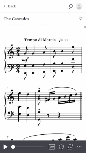
Previously, whenever you viewed a slice on a small screen, the top of the page would have two horizontal sections — our sitewide navigation and the slice information:

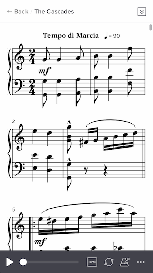
This took up too much valuable screen space! On a small screen, each pixel counts. So we’ve changed it to use only a single header:

This seemingly small change makes things feel a lot less cramped and more spacious.
Improved landscape mode on small screens
When viewing a slice on a small screen in landscape mode, you can now move the video to the left of the notation. We’ve also reduced the size of the controlbar, to give your music even more space.

Native home-screen experience
This one is really nice for people using Soundslice on their phones. You can now get essentially an “app-like” experience by adding Soundslice to your home screen.

If you add Soundslice to your home screen, you’ll get a Soundslice icon that lets you use Soundslice without any of the usual web browser UI (such as the back button or URL bar). It makes a big difference!
If you use Soundslice a lot on your phone, we highly recommend doing this to make the best use of your screen space. Read more in our new help page.