New features and fixes, Oct. 22
October 22, 2020
Here’s what we’ve improved on Soundslice this week:
Shortcut tabs in the slice manager
In your slice manager, you’ll now see some handy filters at the top of the page:

This lets you quickly access the slices that you’ve marked as shareable, posted to your channel or marked as embeddable.
Yes, you can use it in tandem with the search — so you can search your slices for a keyword and then apply the filters.
Improved editor design
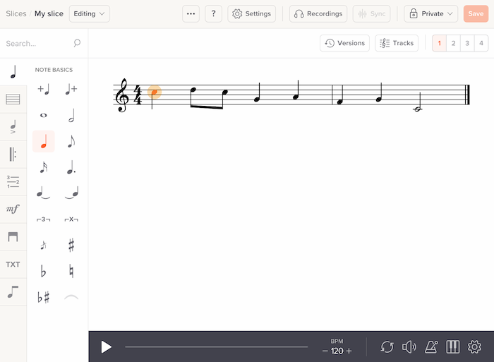
We’ve tweaked our editor’s design to add a visual “frame” around the music. Here’s the old design:

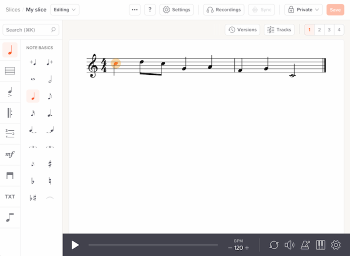
And here’s the new design:

The goal here was to create a clearer visual distinction between your music and the rest of the editor.
We’ve also made some other small visual improvements to the editor. The editor search box now looks more like a standard search box, to help communicate its function. And we tweaked the sidebar’s design to be a bit more consistent with the other parts of the editor.
Support for “common” and “cut time” time signatures
We now support “common time” and “cut time” glyphs for time signatures. You can create them in our editor, and we’ll automatically import them from MusicXML files. Read more in our help page.

Previously we automatically converted these to 4/4 or 2/2 upon import — equivalent but lacking that visual panache.
Improved synth sounds for piano and guitar
We got new synth sounds for the following:
- Guitar: Acoustic nylon
- Guitar: Electric clean
- Guitar: Electric distorted
- Guitar: Electric jazz
- Guitar: Electric muted
- Guitar: Electric overdriven
- Guitar harmonics
- Piano: Bright
- Piano: Electric
- Piano: Electric grand
- Piano: Honky tonk
- Piano: Standard
Of course, Soundslice is all about syncing sheet music with real recordings as opposed to relying on cheesy synth sounds, but synth playback is useful sometimes.
Improved video icons for touch devices
You know those icons that appear when you hover over a video on Soundslice? The ones that let you choose video quality, change position or flip the video side?
Previously these icons were only shown when you hovered your mouse cursor over the video — which meant people using smartphones and tablets couldn’t access them (because they don’t have a mouse!).
This is now fixed. On touchscreen devices, you’ll now see those icons at all times, except when the video is playing.
Fixed slice manager titles not to be truncated
When we launched our navigation redesign last month, user TastyGuitarLessons pointed out in the comments section that long slice titles were getting cut off in the slice manager. This is now fixed.
Is there a lesson here? Good things come to those who post comments to our blog? ;-)