Big notation editor interface improvements
August 6, 2020
We’ve launched some significant usability improvements to our editor! This makes editing sheet music and tablature on Soundslice easier than ever before.
Immediate ‘hover’ feedback
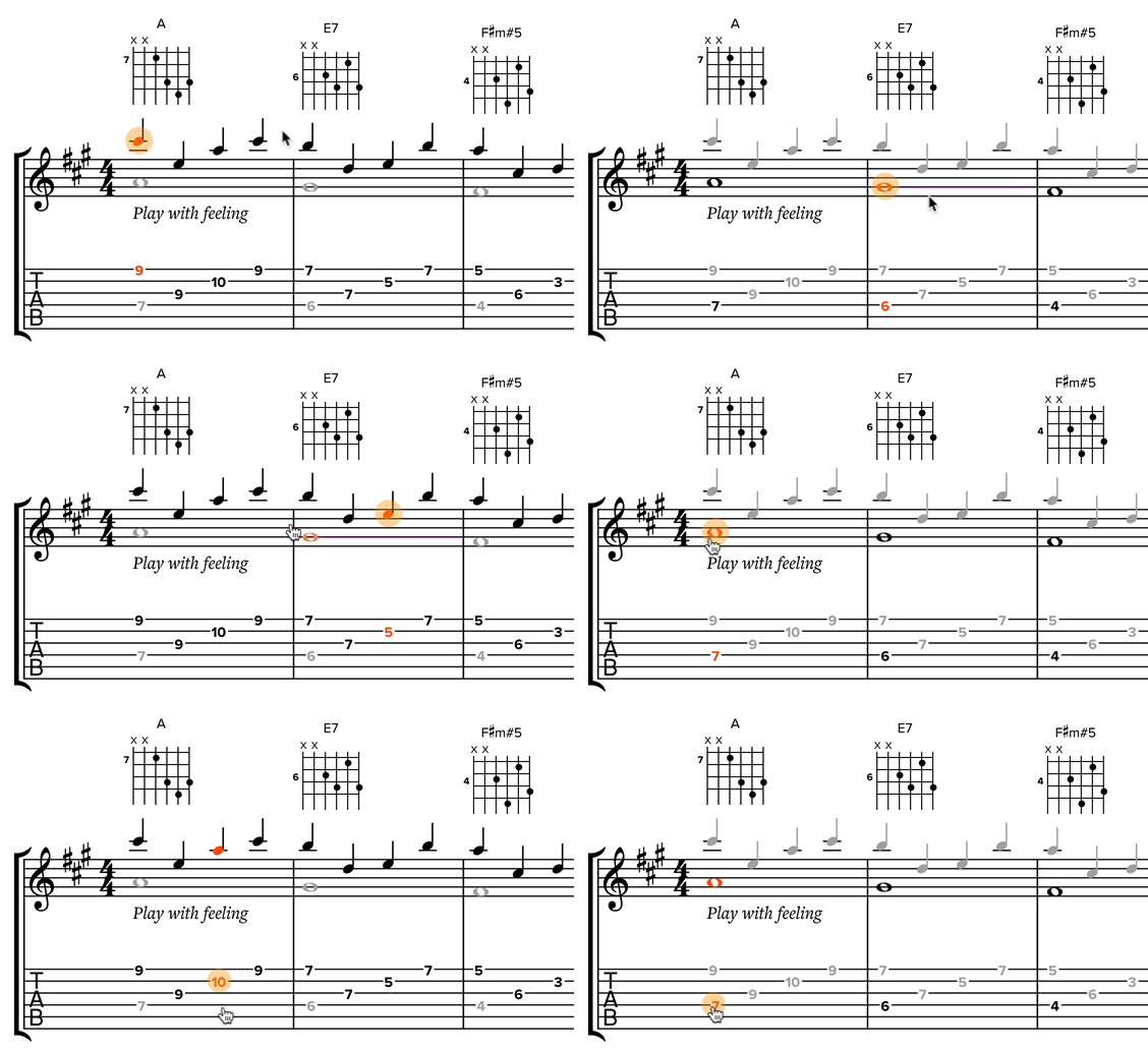
When you hover your mouse cursor over the music, we now give you visual feedback:

The bit of notation you’re hovering over will change color, and your mouse cursor will change to indicate that something is directly editable by clicking on it.
“Wait,” you say. “More than notes and rests are directly editable by clicking now?” Yes —
Clickable notation elements
We’ve made lots more of your music directly clickable.
Previously, our editor’s approach was: you select a note, then edit its attached information (such as text, chords, time signature, key signature) via the “Current” menu or the various icons on the left.
Now, you can click on those bits of notation directly. Here’s what’s directly editable at the moment:
- Time signatures
- Key signatures
- Clefs
- Section names
- Section letters
- Fingering
- Right-hand fingering (for plucked instruments)
- Commentary bar labels
- Bar numbers
- Lyrics
- Our four types of text
- Tempo markings
- Triplet feel/swing markings
- Chord names/diagrams
- Directions (e.g., “D.C. al Coda“)
- Segno and coda symbols
- Fermatas
- End-repeat bars
- Multi-bar rests
- Barre numbers (Roman numeral positions)
The “Current” menu is still available, as not every type of notation would make sense to be clickable. For things like accent marks, you still edit them by clicking the note and toggling the appropriate icon in the “Current” menu.
Change voices by clicking on the note
The concept of multiple voices can be confusing to newcomers to music notation. Historically our editor has grayed-out notes that aren’t in the currently selected voice — which is unintuitive if you don’t know what a voice is.
We’ve made an interface improvement that we think will help with this (along with saving time for more seasoned pros). If you click a note that’s not in your current voice, we’ll now automatically switch the current voice to that note’s voice. Here’s what it looks like:

This makes editing multi-voice music nice and snappy!
Better-looking selections
One more improvement: we’ve improved the look of the selection when you drag to select multiple notes/rests.
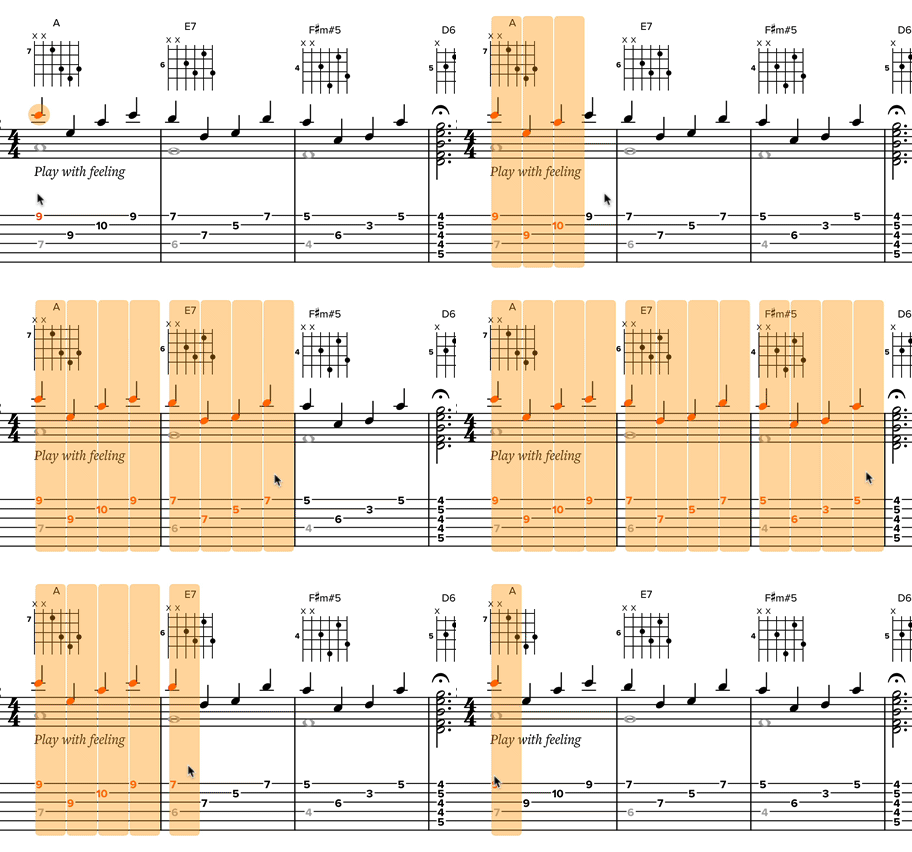
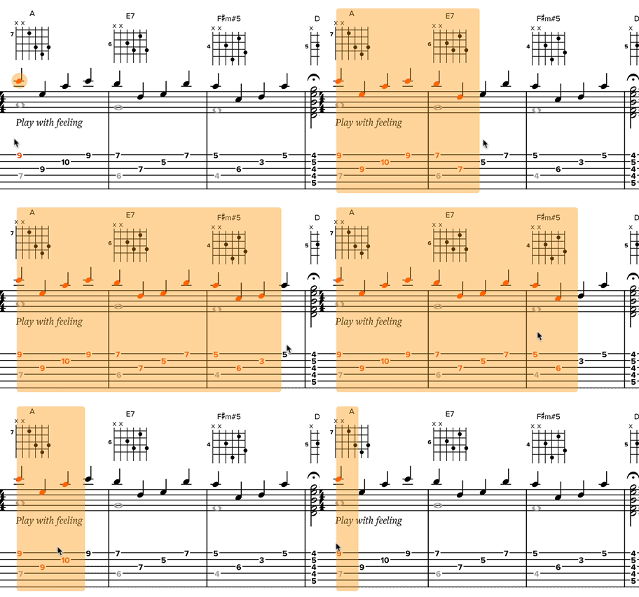
Previously, each note or rest had its own rectangle with rounded corners — resulting in awkward white vertical lines within the selection:

Now, we smash them together into a single rectangle, which looks and feels a lot nicer:

It’s a small detail but brings a little more joy to the editing experience.
Final notes
Please note that these changes only apply to slices in edit mode. If you’re in read-only mode (e.g., the view seen by your students or people looking at posts on your channel), nothing has changed.
Together, all of these changes add up to make the editing experience feel much more interactive and responsive. We hope you enjoy the changes. And we will continue to add polish and make Soundslice the best way to create/edit sheet music and tablature online. :-)