Introducing our notation editor redesign
May 11, 2020
Big news today: We’ve redesigned our notation editor! It’s even more powerful, more beautiful and easier to use than before. We think you’re going to love it.
For a quick overview of what’s new, check out this video:
If you’re just now finding out about Soundslice, welcome to the party. Our notation editor lets you create interactive sheet music (and tablature) quickly and easily. Our killer feature is the ability to sync notation with real audio/video — making us the best tool for transcribing existing recordings and creating music lessons that sync video with notation. And we’re entirely web-based, meaning you don’t need to install any programs or apps.
So what’s new in this redesign? Let’s dive into the details.
A new look
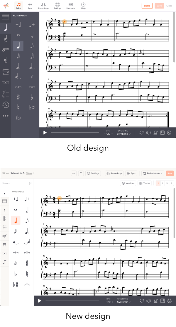
The first thing you’ll notice is the new colors and layout. We’ve made everything lighter in tone, and we’ve reorganized things to live in more intuitive places.

Specifically:
- The left sidebar is thinner, meaning there’s more horizontal space for your music. We’ve reduced the size of the section icons and tweaked the design to make it clearer.
- The top bar has been split into two bars. The first one is for overall slice information — its settings, its recordings, your preferences and our help links — while the second one is specifically for notation things.
- We’ve moved tracks and version history from the left sidebar into the top bar. Previously, they were buried in the left sidebar, which felt like an inappropriate place.
- Likewise, we’ve moved the “Upload notation file” and “Copy another slice” functions from the “...” sidebar menu into the top bar. Again, this is a more natural place for these functions.
- We’ve added the slice’s name and folder in the upper left. Lots of people have requested the ability to easily return to a slice’s folder after editing; you can now do that!
- We’ve reorganized the sidebar’s categories. There are new categories called Engraving, Performance, Repeats and Dynamics.
Otherwise, the primary editor interface — the left sidebar — works the same as before. With one (major and awesome) improvement:
New search feature
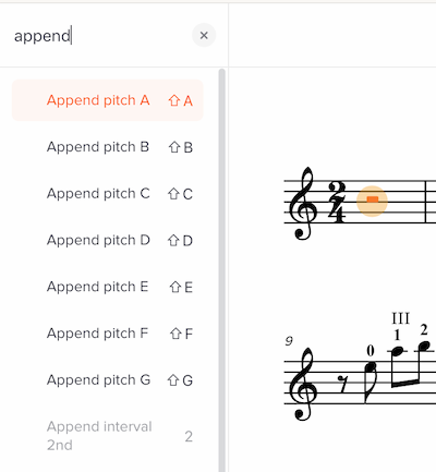
At the top of the sidebar, you’ll now see a search box. Click in there — or use the keyboard shortcut ⌘K (Control+K on Windows) — and you’ll be able to search our editor’s 250+ functions.

Don’t remember which menu “Toggle breath mark” is in, or what the icon looks like? No worries. Just search for it.
Once you’ve done a search, use your up/down arrow keys to select the command you want, then press Enter. It’s super fast, and it means you can do a lot of editing without your fingers leaving the keyboard.
The search results double as a “help” section. For each command in the search results, we display its keyboard shortcut (if available). Yes, this takes your custom keyboard shortcuts into account, if you’ve created some.
And the search is context-aware. That means: If a particular editor command isn’t available for the notation you’re currently selected, the command will be grayed out and moved to the bottom of the search results.
For example, in this screenshot I’ve selected a rest, in which commands like “Append interval” are irrelevant, so those commands are grayed out and moved to the bottom:

Aside from the search just being really darn fast, it has another big benefit: It gives us a place for commands that wouldn’t obviously fit in our normal sidebar. For example, we’ve added the command “Recalculate all beaming.” In our old editor, we would have needed to create an icon for this and find a sidebar location for it — both unnatural given the abstract concept of beam recalculation. In our new editor, we’ve added it to the search, given it a (hopefully) intuitive name, and we’re done. We expect to add many more commands this way going forward.
New “current” feature
Aside from the search, the second genuinely new and useful feature is the “current” section. In this section, we display all notations that are active on the current selection.
Here, the current selection is part of a tuplet, with dynamics, expression text and a section letter — so we display icons for those notations:

You can click any of those icons to open the appropriate editor feature directly. This is super handy, for two reasons. First, it gives you instant information about your selection. Second, it lets you quickly turn off (or change) a specific notation without needing to find the icon or know what it’s called.
New “Concert pitch” toggle
Finally! Our editor now has a “Concert pitch” button, which lets you toggle between concert or transposed pitches. For simplicity, this is only displayed if your slice contains at least one transposing instrument.

If you’re in concert pitch mode, both note entry and note display will be in concert pitch. This is useful if you’re transcribing (or arranging for) a transposing instrument such as Bb clarinet but are more comfortable “thinking in concert pitch.” You can always switch between them, and we’ll use the correct accidentals appropriately.
Easier voice switching
Next to the new “Concert pitch” button, you’ll find our new voice-switching buttons. These show you which voice is currently active, and you can click a voice to switch into it.
Previously, these buttons were buried in one of our editor’s sidebar menus. Now, they’re always visible in the upper right.
Clearer privacy settings
Previously, it wasn’t easy to find out whether your slice has been made public, embedded, etc. Our old editor had a “Share” menu at upper right, and you had to click that to see and change the status.
Now, we display the privacy settings directly at all times. The new privacy button at upper right will show you the current setting, and it makes it fast and easy to change.

As before, everything you create on Soundslice is private by default. If you want to share it — say, post it to your Soundslice channel or embed it in your own website — you can change that via this button.
Better mobile design
Our previous editor wasn’t optimized for small screens, and it was only possible to make a few types of edits. In our redesign, we’ve greatly improved things. The interface scales down to smaller screens, and you can make many types of edits. There’s more work to be done here, but it’s so much better now.
Custom tuning for tab tracks
Finally! This has been one of our most-requested features. When creating a tab track, you’re no longer limited to our list of supported tunings. You can now create a custom tuning:

As part of this, you now also have control over the way tuning is labeled in notation. Previously, if you used Drop D in guitar and wanted to rename it to “Tune low E string down a step,” you couldn’t do that; now you can.
Custom tuning is available to everybody who has a paid plan.
Editor preferences
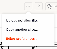
We’ve introduced the concept of editor preferences. At the moment, there are two:
- Play sound when note is selected: None, Play note or Play chord
- Play sound when note is input: None, Play note or Play chord
You can access these via the editor’s “...” icon:

Now that we have the infrastructure for preferences, we’ll be adding more options here in the future. Let us know what preferences you’d like to be able to set.
Editor preferences are available to everybody who has a paid plan.
Direct feedback in text editing
Previously, when you added or edited text, you would do that in a popup window and wouldn’t see your changes until you clicked “OK” to exit the window.
Now, text entry uses a lighter-weight interface, where you’ll see your notation update instantly as you enter text or change its formatting.

We plan to make this interface available for other notations as well, including chords and lyrics.
Clearer route into the editor
Previously, if you wanted to edit one of your slices, you had to first open it, then click “Edit” in the lower right.
Now, this is greatly simplified. If you access a slice via your slice manager, it’ll be opened in edit mode directly.
If you view one of your slices in another context — say, on your channel — then you’ll see the “Edit” button at lower right as before.
Feedback?
We hope you love the new editor. And we’d love your feedback. Let us know here in the comments, or contact us any time.